
The Return
It feels like its been quite some time since the last entry to this blog for class. I feel a little out of practice. Of course I had all kind of intentions of continuing to blog through the summer as I enjoyed some quality professional development and quality vacation. But as they say about good intentions…
Setting the stage
So here we are and I’m excited about this course. I’m not necessarily great at it but I do enjoy design. I dabble with it from time to time and enjoy exploring my creative side.

I’ve had several blogs and webpages that I’m constantly tinkering with to try to get them looking just right. We even just recently launched a blog for our 8th grade at Lincoln. The students are responsible for the content, but I’m taking care of the design. I’ve got big plans…
I actually had to come back and add this bit. 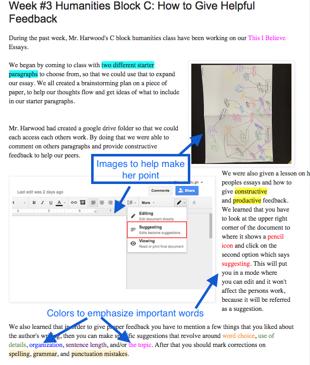 As I reflected on my writing and content I thought back to the first student post for my humanities class. Nisreen actually applied a lot of the concepts discussed in the articles this week. Check it out here:
The Work
As for my COETAIL blog, I’ve definitely made some improvements. I’ve included a screen shot here of the old page.
 As I look at it now, it is filled with the wrong kind of CRAP and needed a good bit of work. To be fair, there are quite a few limitations to the themes that are available, but I still knew I could do better.
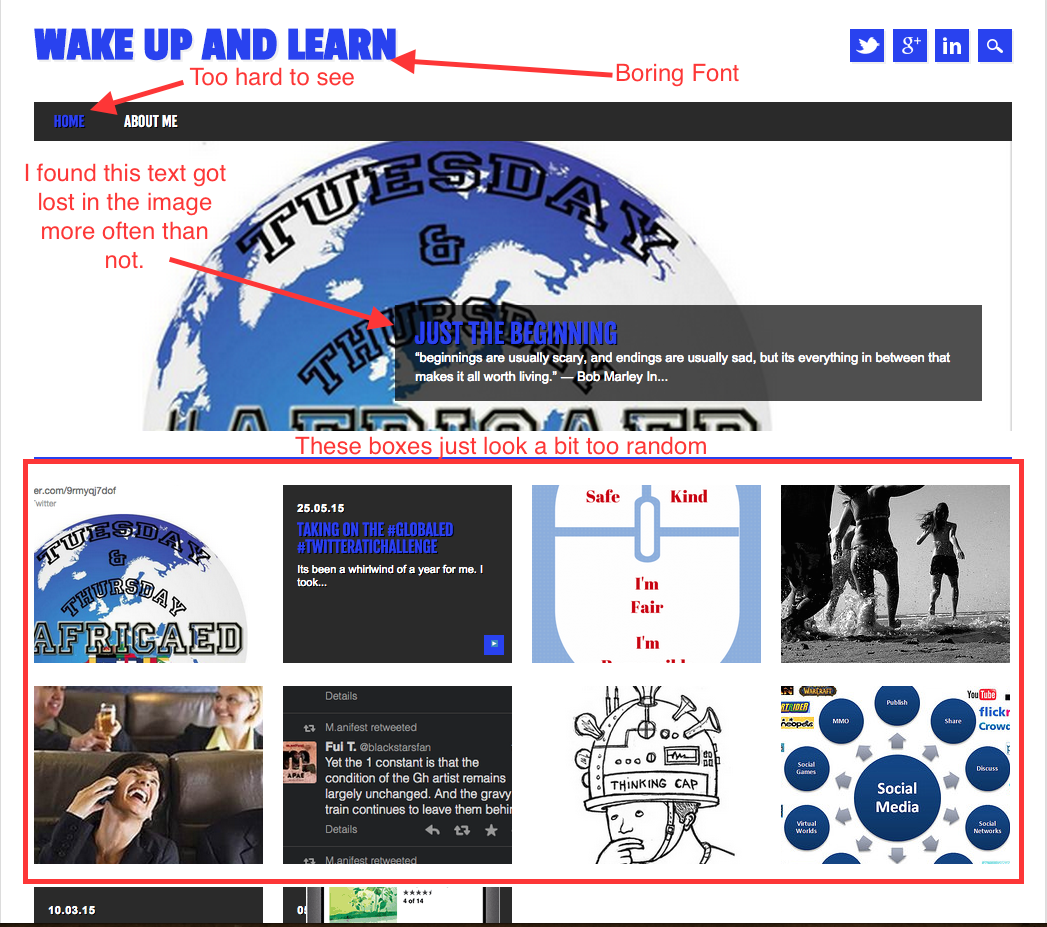
I think that as you enjoy the ease of a short easy read thanks to employing some concepts from Brandon Jones’ article on visual hierarchies you’ll agree that vast improvements have been made. I don’t think I’d call it perfect yet. There are still some things I’d like to figure out how to accomplish.
At a minimum, I’d like to have some sort of border around the widgets on the side and perhaps even have them fade to a slightly lighter color while the reader is focusing on my writing. I’d also like to have a bit more control over my fonts. Not to go crazy or anything, but just to be able to make things a bit more interesting. Maybe my new coding club will help me figure some of this stuff out.
Classroom Application
So now to apply this to my teaching. The class blog is an obvious example, but I think James Daly’s interview with George Lucas makes some great points.
If you’re going to put together a multimedia project, you need to know that you can’t have a fast rhythm track if you’re talking about death. It just doesn’t work. You’re not communicating well.
I know this, and you probably know this, but do kids know this? I can recall posters about the black plaque that were done on neon paper, student videos about the industrial revolution that had hip hop music, with lyrics, in the background of the voice over and countless other fantastic design flaws. If we really want students to learn to express themselves, we need to discuss this and give them the tools to be successful. Students are asked to make countless posters, pamphlets, presentations and Power Points throughout their careers. Just as we spend time helping students craft their essay writing skills, we should help them build their visual expression skills as well.

Great work with the blog ‘redesign’. I completely agree in that the blog templates are a bit limiting. After reading more about visual hierarchy and such, I’m surprised some of those templates even made the cut! I think I ended up changing my theme to this same one. It’s just ‘cleaner’ or something.
I like the G.Lucas quote in your last section of text. A few years ago I was teaching 6th grade and had my kids make book trailers for their literature circle books. They had to have music in the background and immediately they were all trying to figure out how they could use one of their favorite songs (of course). A quick lesson on ‘mood and tone’ of the book solved that problem pretty quickly. They soon found some great music (sans lyrics) that expressed the tone of their books perfectly. It makes me realize that some of these lessons can be very quick, and often happen on the fly. But it’s good to have the knowledge base (like CRAP) to use when those instances occur. Good luck figuring out how to tweak more things on your blog!
LikeLike
Thanks Jodee. Its true. Many of these lessons can be quick ones and don’t have to go deep into design theory. Just making kids aware and encouraging them to stop and think about what they are doing can help them with design.
LikeLike
Applying this learning in the classroom is important! We HAVE to teach these skills to kids or we’ll continue getting white boxed images on neon green backgrounds with yellow fonts! EEK! I found this site http://paper-leaf.com/blog/2012/10/principles-of-design-quick-reference-poster/ that may be a helpful visual in your classroom. I think these could easily be added to our tech standards so students continue to develop their understanding of CRAP as they move through their schooling.
LikeLike
Argh. Yes, the Cyndi Lauper color scheme just doesn’t work for presentations. I love the poster. I think I might print that and add it to the resources page on our class blog. Thanks for sharing.
LikeLike
I really like your blog design, Ryan. It tells us something about what you value. It’s personal and fresh. And the twitter feed is a good idea. I’ve been meaning to get on that as well. I agree with you and Jodee – many of the design templates felt too busy.
LikeLike
Thanks Leah. It feels better than the other plan. I always like it when I see someone’s Twitter feed on a page. It’s a quick glance into their ideas.
LikeLike
Hi Ryan
I really love that you share the before and after of the projects that you are undertaking. I imagine it is fun for you as well, to look back at the changes you have made. These projects have made me think about my own products as well as how I teach these ideas to the pupils. I especially appreciate the last paragraph where you discuss how pupils present information. This made me smile as I have had very similar experiences – pupils using a rainbow background to present statistics for a business proposal and adding hearts over a website they created that was for a pet company. They just happened to love hearts. When we look at colours I find this an interesting chart http://www.huffingtonpost.com/brian-honigman/psychology-color-design-infographic_b_2516608.html as it gives them some ideas about how business uses colour to communicate with us on a daily basis. Well now I need to improve my own blog – as yet I have not been as brave as you and have not evidenced it’s current state. Maybe I should to give me the incentive to proceed – out of interest when you overhauled yours what aspects did you find the hardest? and do you have any tips!
LikeLike
Hi Cate. I do enjoy looking back at the before and after to see improvements, or see what else I might want to change. Thanks for sharing the link too. I just designed a profile image for our MS Twitter account and I’m realizing now I could make a better use of color after looking over the chart. One more thing to work on…
As for updating my blog, I think the hardest thing was just finding the right theme. Several of them just didn’t work. They messed up the layout too much or pictures would not show up. It was a lot of trial and error but I enjoyed it. I like to learn as I figure things out.
LikeLike