
Infographics. Why don’t I remember to use them more in my classes? When I’ve used them in the past, students have absolutely loved them. I’ve even taken a shot or two at having students create their own. From that experience I learned that it takes a good bit of explaining and patience. I might get around to that again. We’ll see.
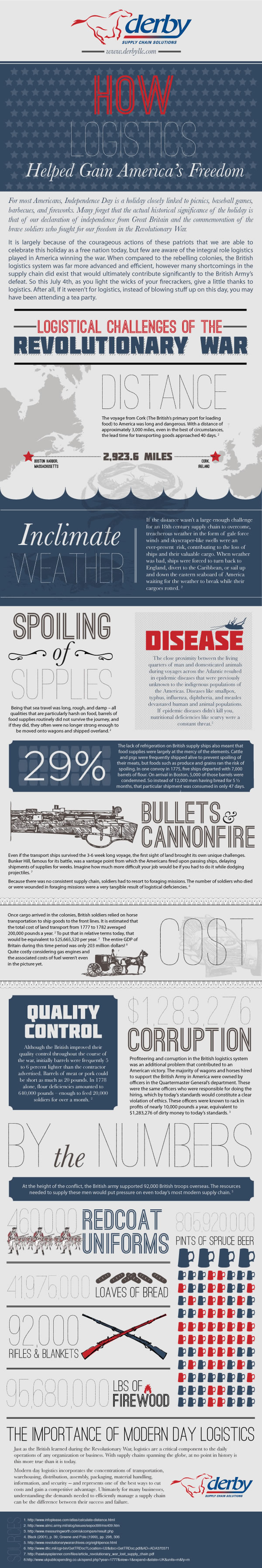 One of my favorites that I have used in the past is from a logistics company. It is a pretty fascinating look at the way goods had to be moved across oceans and the creation of supply lines during the American Revolution. It has a bunch of big numbers and interesting trivia about the Revolution. The information includes ideas that we don’t usually talk about in the classroom version of the American Revolution which is probably exactly why students find it so interesting.
We’re talking about revolutions in class right now and I hope to pull a few others into the mix. However, I’ve found it difficult to find infographics from their original sources. A quick search on Google uncovers a plethora of infographics on revolutions of every kind, but trying to get to their source can be tricky. To me this seems an important part of using them in the classroom. If I’m just pulling random infographics from the internet, how do I know the information is correct?
This is actually one of the things I like most about the infographic above. It has fascinating information, and also allows us to talk about the purpose of the infographic. Most students will go with the old literature class answer of to educate and inform. Eventually someone will notice that it is an advertisement with a slightly different purpose and another great conversation begins. Exactly what we want.
Image Credit:
Derby Supply Chain Solutions: http://www.derbyllc.com/how-logistics-helped-gain-americas-freedom/#.VhwdRhPtmko
